
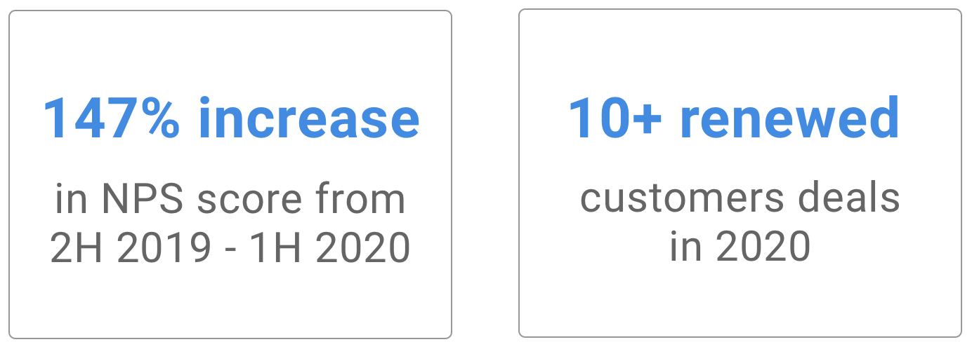
Using multiple accounts in one place is core to work productivity — however, it was missing in Email+, forcing users to move away to alternate platforms. I led the design of multiple accounts, a top feature requested by 26 customers, that contributed to 147% increase in NPS score in just half a year.
Role
Lead UX Designer —ideation, wireframe, prototype, competitive analysis, usability testing, semi-structured interviews
Team
Sr. Product Manager, Engineering Lead, QA Manager, Director of Engineering
Product & Timeline
MobileIron Email+ on Android, iOS, iPadOS. Released over 3 sprints.
01. Problem
Pam Beesly is a personal exec assistant at DunderMifflin. Her daily routine involves using 3 separate email accounts for work. While she has these accounts set up on her desktop, she has only 1 account (her work email) on Email+ app on her phone. And so, she often runs into the following scenarios:

Delegated Account
“I jumped out of bed in the middle of the night to look for my laptop and set up invite on Michael’s (her boss) behalf!!”

Shared Account
“I can’t reply to any urgent emails from my group mail on the subway. I need to get into office to do that”

Personal Account
“I missed my daughter’s Parent-Teacher meeting because I forgot to look at my personal calendar”
Without multiple accounts on her phone, Pam is constantly frustrated. It results in loss of her time & work productivity.

How can Pam seamlessly switch between all her email accounts — so that she is always productive — whether at lunch, on the subway or the grocery store?
02. Overview

Multiple Accounts — Pam can be productive in all contexts and quickly switch between her work account, boss’ accounts and group account!

Remind user of current account — Email+ informs Pam which account she is in when she sends out a mail/invite/creates a task.

Personal & Work Calendar — Email+ also syncs her personal gmail calendar so that she can decide when to book her next doctor’s appointment or even be reminded of her daughter Cece’s PTA meeting!
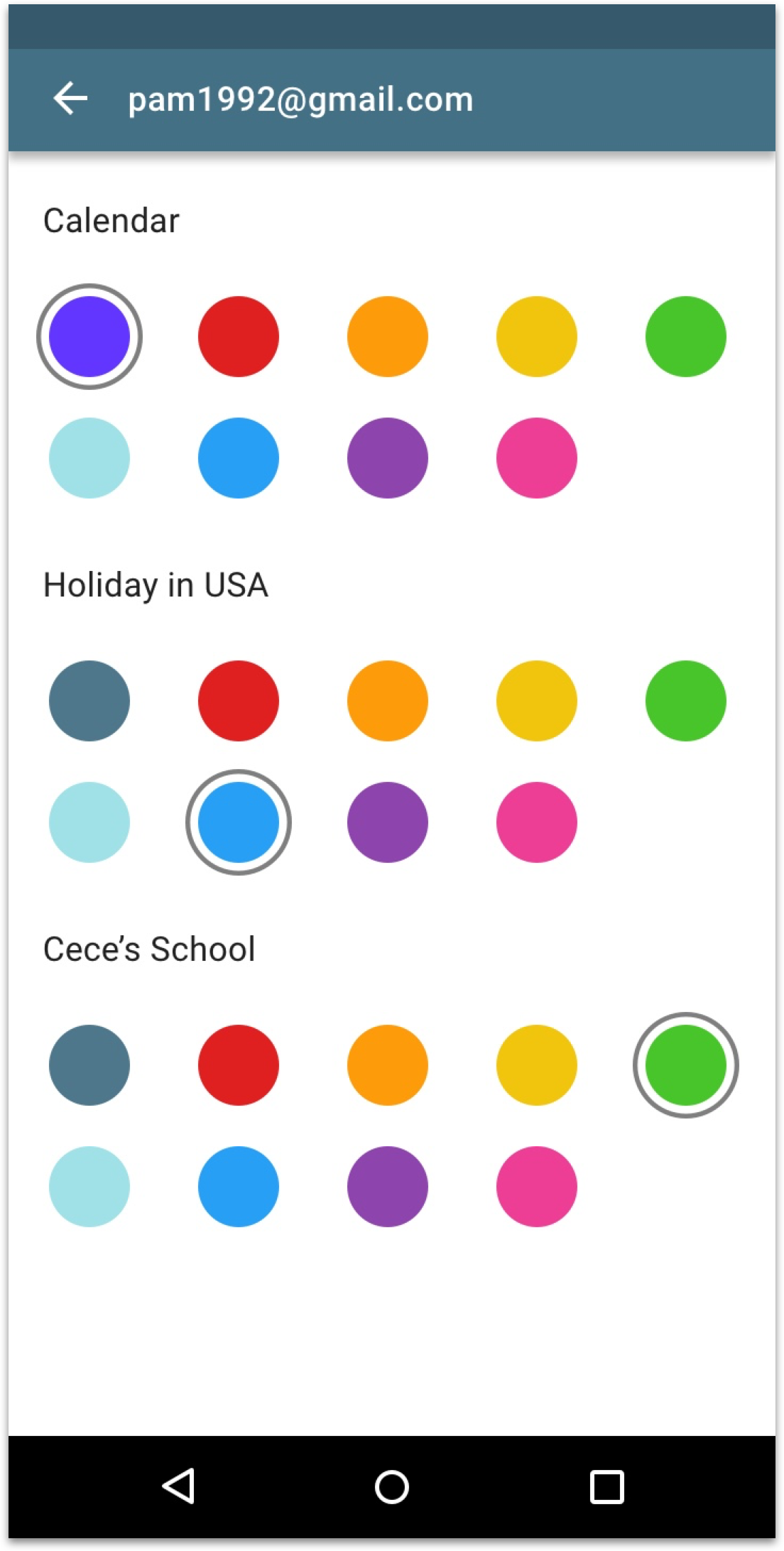
Customize Calendar Color — To retain Pam’s mental model, Email+ syncs the same calendar color from her personal calendar. But if she wants to change, she has a wide range of colors to choose from!

Re-architected Settings — Pam can change account specific settings and general settings

Account specific settings — Pam can customize email signatures for individual accounts or turn off notifications for one of em!
03. Defining Scope
Our top priority was to tackle the shared and delegated use-cases. These use-cases had 2 personas — the owner and the member. The owner would be Michael Scott who creates a group account or delegates it. The member would be his assistant like Pam.

Worked with PM to define roadmap for multiple accounts
I worked with the product manager to create the roadmap for multiple accounts. We discussed team bandwidth and “required” VS “nice to have” functionality. We then agreed on the plan to ship over multiple releases. For phase 1, we wanted to focus Pam’s experience and defined the scope for it.
04. Research
Since this feature was requested by 26 customers, we had the use-cases laid out for us. However I still wanted to understand granular user behavior such as how many accounts do users use on an average, the switching patterns, do they prefer combined account view and so on. So I conducted semi-structured interviews with 6 internal employees that there assistants to execs and those who used group email IDs.

I also conducted competitive analysis of productivity and consumer facing apps to analyze common design patterns and interactions.
05. Ideation & Iterations
How can users easily switch between accounts?
Research
Through 26 customer requests tickets and 5 interviews with internal employees I learnt : 01. Users use 2-5 accounts avg. 02. Users prefer working on one account at a time for emails, contacts, notes & tasks. 03. The frequency of switching various based on roles — more frequent for group email and less for delegated use-case
Goals
Once I had research insights, I set the following goals while designing:
01. Reduce amount of steps & distance to switch between accounts. 02. Make account switching easily discoverable/call to action obvious 03. Consistent experience across email, calendar, contacts, notes & tasks
Design
I initially did a “crazy 8” sort of ideation and finally narrowed down on the nav drawer to host account switching. It was a common UI component and hence a consistent entry point. I furthered ideated within the drawer and weighed options based on how much distance the user’s finger would have to travel for account switch.
How can we design an intuitive combined calendar view?
Research
01. From interviews learnt that users in all 3 use-cases wanted to see multiple calendars in one view. For example, personal assistants wanted to see calendars of 2 execs to check an available slot.
02. When syncing personal calendars, users mental model was tied to an existing color for calendars/events.
Design
Since color was tied to a particular account, I wanted to reinforce the same experience and used color for events. The key challenge here was when we sync personal events should we override it with our branded color or retain existing color? We finally made a trade off by syncing color from personal calendar and giving users flexibility of changing it in case of duplication.
How can we help users navigate through Settings?
With new account changes, I re-arranged the information architecture of Settings into account specific and general ones common across all accounts.
04. Final Design
Overview of screens

Visual Evolution

Consistent experience across Android & iOS

05 Impact

Pam’s reaction when Email+ shipped multiple accounts (Based on a true story)