Today, more than ever before, users are concerned about privacy. MobileIron was doing a poor job with being transparent about data collection — causing a barrier to entry for new users. I led the design of this UX initiative to build trust in our app, thereby increasing user growth.
Role
UX Design— wireframe, prototype, customer feedback, usability testing
Management — problem discovery, define scope for incremental phases
Team
Product Manager, Client & Server Engineering Leads, Deputy General Counsel (Legal), QA Manager, Visual Designer
Product & Platforms
Mobile@Work & MobileIronGo apps on iOS, iPadOS, MacOS, Web
01. Problem
Dwight Schrute is a salesman at Dunder Mifflin. When he joined the company, the IT team asked him to download the Mobile@Work app so that he could get access to his work resources like email, slack, ServiceNow etc.
Once Dwight downloaded the app, he noticed that his personal phone had become “managed” by his IT and needed permissions like Location. While IT uses location to find a stolen device or detect threats, Dwight perceived this as “my company is tracking my every move” or “my IT is reading my emails”. And so, he uninstalled the app.

Dwight feeling concerned about privacy of his data while using Mobile@Work app
Dwight was not alone in being concerned about privacy. The UX team discovered the follow quantitative insights that corroborated with Dwight’s situation :
MixPanel showed that 50% of new users were dropping off from registration after viewing Privacy Statement.
Sales Reps were receiving 2 calls per week from anonymous users expressing privacy concerns.
How can we build trust among users like Dwight and in turn increase user growth?
02. Overview
Being transparent about data — Building trust by clearly telling users what is collected, why and what is not collected

“What’s in it for me?” — Being transparent with users about why their permission is needed and how it will benefit them

Ask permission only when needed — When user switches from LTE to WiFi, a notification is sent for detecting threats in network

Gently nudging users to turn on location — Non-disruptive card asking users to to change location preferences to “Always” but giving them agency to dismiss it

Making it easier to turn on permissions — Adding custom button to Settings to increase likelihood of turning on permission

Playful texts for missing permission — When user navigates to Maps, reminding them in context that the permission is off and providing them a shortcut to Settings
03. Research
Why are users concerned about privacy?
To understand, why users are concerned about privacy, I first did a UX audit across 2 versions of the app we offer (cloud & on prem), 3 registration flows (app & web) and 5 enrollment modes. Next, I went through video summaries of foundational research we had conducted with our EMEA customers to see if there is some data. I also shadowed new hire orientations where employees were asked to download and register to MobileIron app for the first time.
Shadowing employee orientation to understand pain points
From the audit and research, I summarized the common pain points :
01. App lacks transparency — “I do not know clearly what data is collected and what is not.”
02. App lacks clarity on “why” a permission is needed.
03. Permissions asked out of context and not when user is ready to give it.
04.Privacy statement was missing for 1 of 2 types of apps, 2 of 3 registration flows and 4 of 5 enrollment modes.
I also mapped a new user’s journey along with their emotions which helped me later in my process to make design decisions.
A new user’s journey
04. Iterations & Challenges
From research, I was able to identify 3 major parts of our app that needed improvement — the privacy statement, the location permission and all other app permissions. I tackled these challenges by brainstorming ideas and validating them with stakeholder feedback, peer reviews and internal user testing.
Challenge 01
How can our Privacy Statement be more transparent and personal?
Privacy statement was one of the first few screens users would see during their registration flow and presented a good opportunity to build trust from the get-go. MixPanel data revealed that users were dropping off after the viewing the statement, so we clearly had to improve it by increasing data transparency.
Old user flow
The first design decision I made was re-arranging the privacy statement in the user’s journey. I switched the Privacy Statement with Terms of Conditions so that users are 1) first aware of how their data is used and then 2) make an informed decision to accept or decline.
New user flow
Next I worked on redesigning the privacy statement. My design goals were clearly inform user what data is collected, why it is collected and what is not. This screen went through a series of iterations. An initial idea I had was to white label the screen with the customer’s logo to gain user’s trust, however this idea was discarded due to extensive server work. With user testing, the design evolved to exclude permissions and put more emphasis on why the data is collected.
Privacy Statement — Iterations
In early discussions with engineering, I learnt that data collected changes based on user’s enrollment mode and IT set configs. This presented a design opportunity to personalize the screen. So I worked relentlessly with 6 engineering leads across the org to gather privacy data and created accurate privacy statements that would appear dynamically during user registration.
Worked with 6 Engineering leads to gather data
Create dynamic privacy statements (based on data above)
While designing, I also constantly perused MobileIron’s product privacy statement for our different offerings and device types. I worked with Legal to ensure all texts are legally compliant. Special attention was to be paid to tone and accuracy of content — “email” VS “personal email” , “data is collected” VS “data maybe collected.”
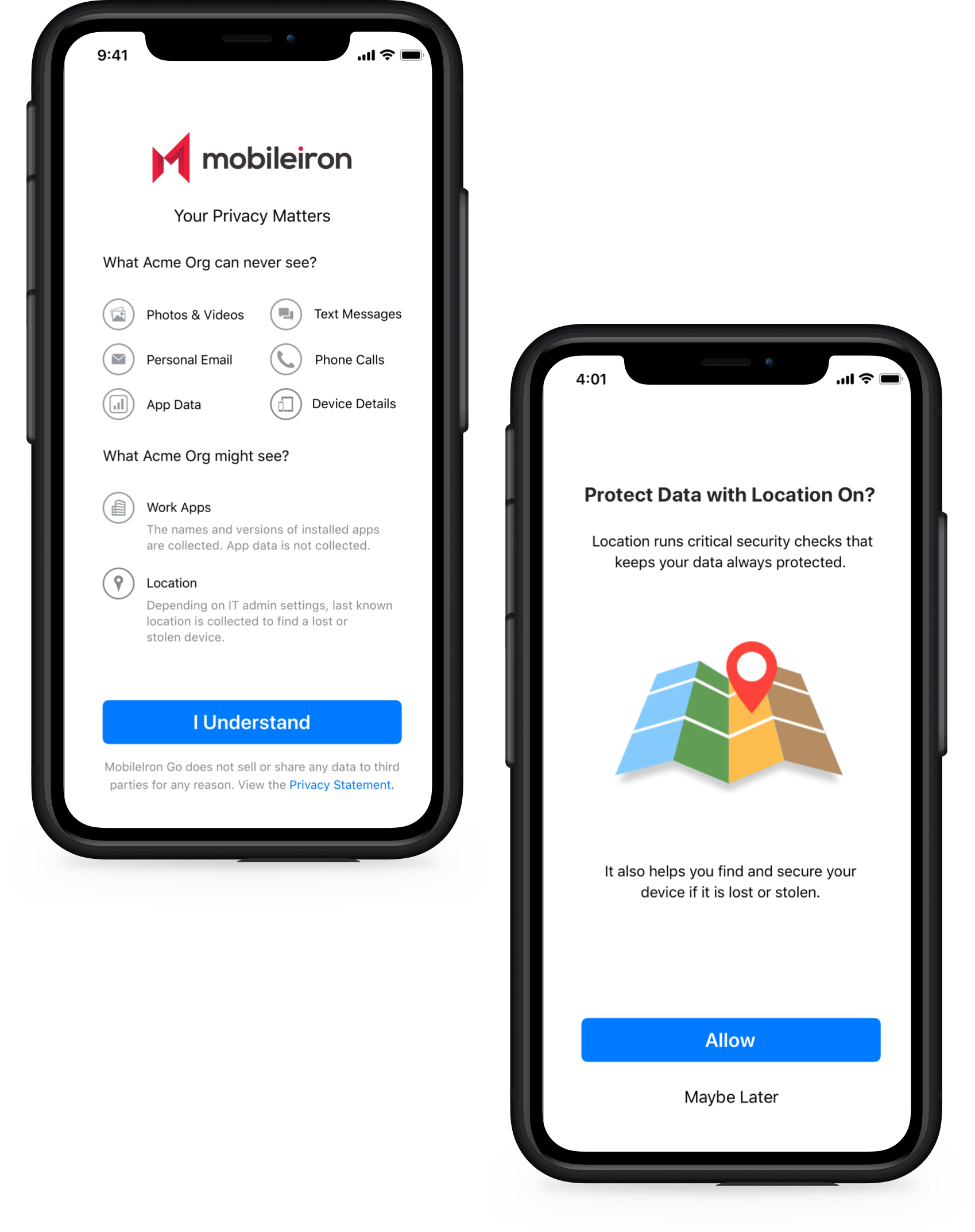
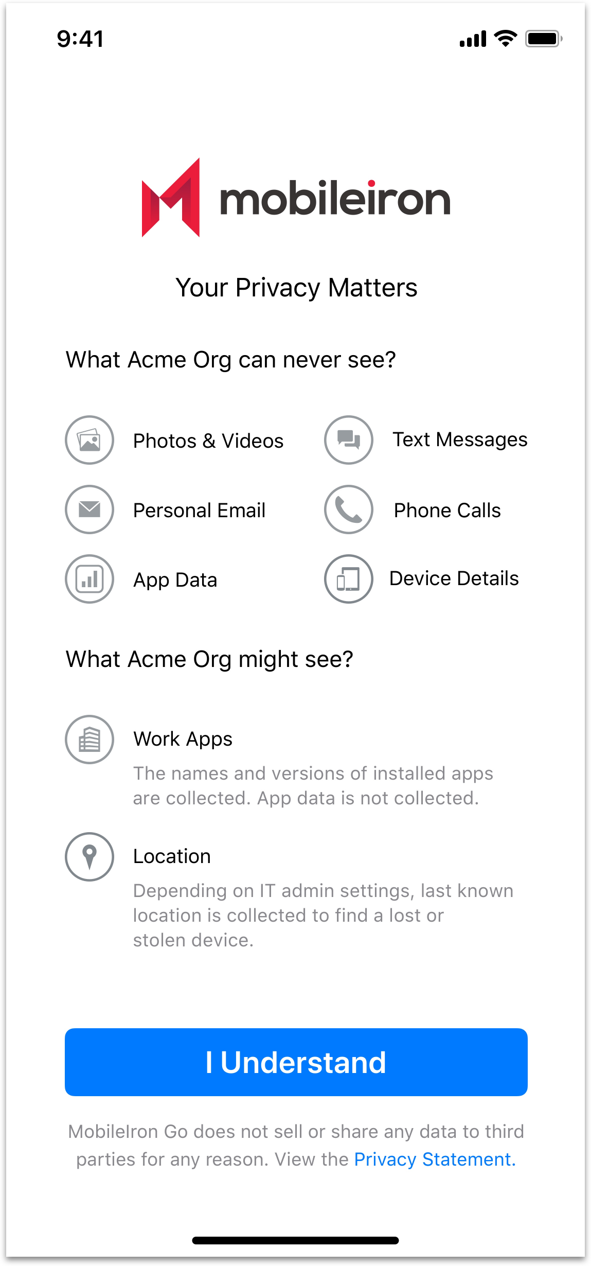
Final Privacy Statement
Challenge 02
How can we clear misconceptions & apprehension around “Location”?
The second critical part of privacy enhancement was to clear apprehension around location. While location is used by MobileIron to find a lost/stolen device or protect data from threats, employees like Dwight often misconceived it as “my organization is tracking my every move.”
Old user flow
Our app required location to be on “Always” so that it can run critical checks in the background and protect user data. I first started designing with a custom “Allow Always” button but soon was faced with Apple’s strict technical constraints. Apple had an unavoidable system alert (shown below) that popped up during every permission. Further, as a designer, I don’t have control over options in the alert so I couldn’t set “Always” as an option.
First time location permission is asked — Iterations
So this meant that the user would give location permission once and I had to design a flow to get the user to change their preferences to Always. This was especially challenging because of an average user’s resistance to sharing location! So while brainstorming the new flow I kept asking myself 1) How soon can the app ask for permission without causing annoyance? 2) How can we reduce number of steps to turn on location? 3) How can we be less disruptive/intrusive?
Asking users to change their location preferences to always — Explorations
Challenge 03
How can we get users to “Allow” permissions in the app?
Last, but not the least, I worked on improving all our app permissions. Some of the permissions were scattered throughout the registration and popped up out of context. For example, notification permission popped up as soon as users opened the app for the very first time — a disruptive and distasteful start.
To tackle the app permissions, I used the journey map to gauge when a user is likely to give permission based on emotions and identified points of entry. One idea was to ask for permissions after user has registered — through an onboarding process — a point where user is relaxed and ready to use the app. I also brainstormed different contexts/external factors (calls, battery down) that might distract users from giving permissions.
While designing permissions, I kept the following goals in mind 1) Ask for permissions only when needed 2) Inform user “why” a permission is being asked 3)Explain in user friendly way how will it benefit the user? Throughout the permissions revamp, I worked with QE, visual designer to translate technical permissions to user friendly texts.
Before — Permission asked as soon as user installs opens app for the first time. Disruptive and distasteful start.

Ask permission only when needed — When user switches from LTE to WiFi, a notification is sent for detecting threats in network

After — Permission asked in context after accepting Terms of Services. User trusts the app & is ready to use it

Shortcut to turn on permissions — Making it easier for users to turn on camera permission, by reducing number of steps to Settings
05. Negotiations & Scoping
It took me almost 2 quarters to negotiate with stakeholders and get this UX initiative prioritized onto the roadmap. With customer requests and iOS 14 features, this ticket was on and off the roadmap multiple times. I worked persistently with PM, client and server teams to vet out all technical hurdles. As I brought in more data points from different sources, my chances of getting buy-in from stakeholders increased. Even after the design was complete, we did not have the bandwidth to roll it out in one release. So I scoped the experience into incremental phases such that each phase brings value to end-users.
After several negotiations, scoped experience for incremental changes
06. Final Design
07. Impact
While we have not gathered enough statistical data, we had feedback sessions with 4 key customers and continue to receive positive response to the new improvements:
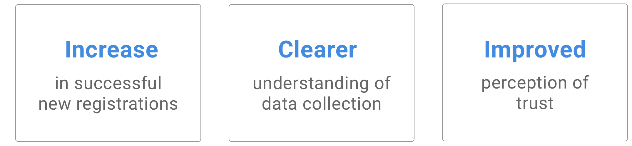
“I definitely feel more confident with the app now that I know what data of mine is NOT collected!”

Dwight and his boss Michael feeling much better about MobileIron and Privacy
08. Ethics in Design
This project is really close to my heart as it made me reflect about my responsibility as a designer. As a business, we wanted users to share their data so that the app functions properly. So as a user advocate, it was my responsibility to design the experience so we are fully transparent with users about their data so they can make an informed decision to share it. I happened to watch “Social Dilemma” on Netflix around the same time — which was a good reminder about the power of design and how important it is design our products ethically.
